thin.ly Blog
Understanding Link Analytics: What the Numbers Actually Mean
Click counts, geographic data, devices, referrers — every link service shows them, very few teams know what to do with them. A field guide to the metrics, what they don't tell you, and the questions you should be asking instead.

Every link-management dashboard shows the same four or five numbers: total clicks, unique clicks, top countries, top referrers, device split. They’re useful for sanity-checking that a campaign is running, and not much else by default. The interesting work starts when you treat those numbers as inputs to specific questions instead of as the report itself.
This article goes through the standard metrics, what they actually measure, and the questions they’re worth asking.
Clicks vs. unique clicks
Total clicks is the count of redirects served. Unique clicks dedupes by visitor, usually by IP address combined with a short time window.
The gap between the two tells you something the headline number doesn’t. A 50% unique rate (10 total clicks, 5 unique visitors) means heavy revisitation — your audience is bouncing back to the link multiple times, which is normal for documentation, reference pages, and resources people need repeatedly. A 95% unique rate (10 clicks, 9.5 unique) means each visitor came once and didn’t return — normal for promotional links and one-time content.
Neither pattern is “good” or “bad” on its own. They are a signal about the relationship between your content and your audience. A documentation link with a 95% unique rate suggests people aren’t returning to consult it, which means either the content was insufficient or one-and-done was the right outcome. A promotional link with a 50% unique rate is suspicious — you may be looking at click farms, ad-network bots, or your own QA team clicking repeatedly.
The most important caveat: IP-based deduplication is approximate. Two users on the same office NAT show up as one IP. One user on a mobile network that rotates IPs shows up as several. Trust the trends, not the absolute numbers.

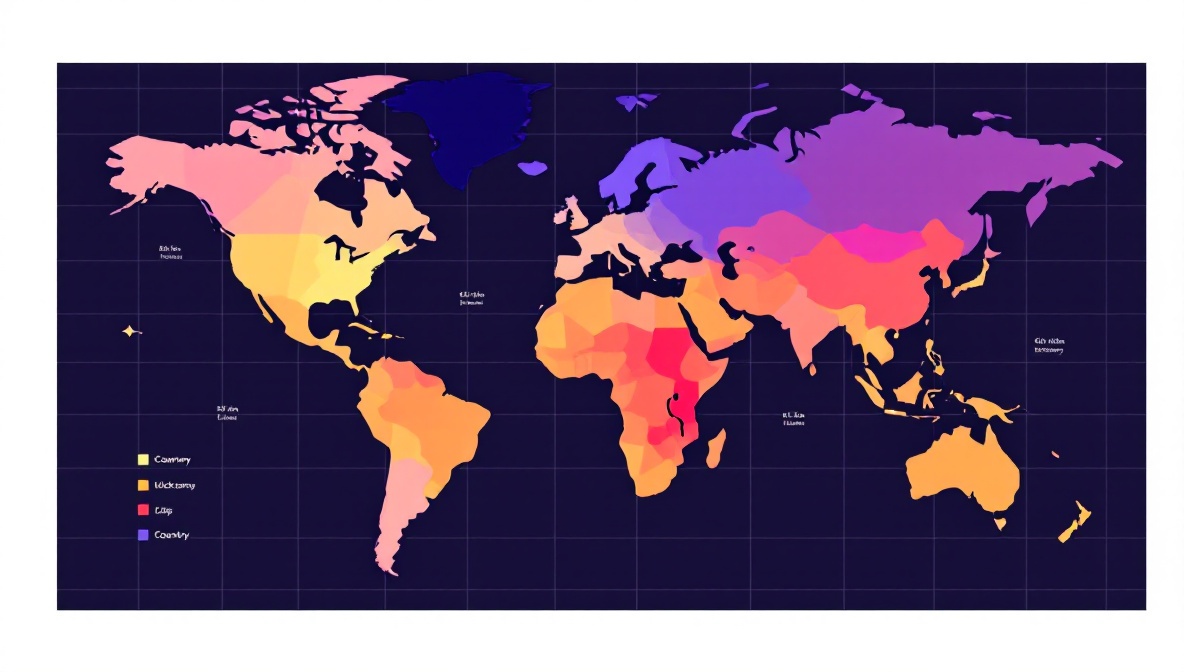
Geographic distribution
Country-level data is reliable. City-level data is less reliable. Both come from a GeoIP database that maps IP addresses to locations, and the mapping has known limitations:
- VPNs and proxies are very common. A user connecting through a London VPN exit node shows up as a London click regardless of where they actually are.
- Mobile carriers sometimes route traffic through gateways in different regions than the user. A US user on T-Mobile occasionally shows up as Seattle even if they’re in Atlanta.
- Cellular IPs can be reassigned across cities in minutes.
The useful questions to ask:
- Is the geographic shape broadly what you expected? If you ran a campaign aimed at US small businesses and most of your clicks are in Vietnam, you’re probably looking at scraper or bot traffic.
- Is the distribution stable across days, or do you have one spike from a country you didn’t target? A single-day Brazil spike usually means you got mentioned somewhere — a blog post, a forum thread, a newsletter.
- Are there countries you targeted that show no clicks? That’s worth investigating before you blame the targeting; the GeoIP database may be mis-mapping them.
Referrers
The referrer is the URL of the page the user was on when they clicked. It’s usually the most actionable piece of data on the dashboard because it tells you which surfaces are actually sending traffic.
Limitations to know about:
- Direct traffic doesn’t mean someone typed your URL from memory. It means the browser sent no referrer header. The most common cause is a click from inside an app — Slack, Discord, WhatsApp, Twitter — where the platform doesn’t expose the originating URL. Mobile clicks are disproportionately “direct” for this reason.
- HTTPS-to-HTTP links strip the referrer for privacy. Increasingly rare now that almost everything is HTTPS.
- Referrer policies (
Referrer-Policy: no-referrer) on the source site strip the value. Search engines and major social platforms apply policies that send only the origin, not the full URL — you’ll seegoogle.combut not the specific search results page.
A high “direct” share isn’t a failure; it usually means messaging-app traffic is doing the work. If you’re running a campaign and direct clicks are 70% of the total, look for the conversation. There’s a Slack or WhatsApp or Discord thread out there driving the campaign that doesn’t appear in your referrer report.
Device split
The mobile/desktop/tablet split tells you what kind of moment the click represents. A short link distributed via email shows desktop dominance during work hours and a slow shift to mobile in the evening. A short link distributed on Instagram Stories is 95%+ mobile by definition.
Device data is reliable because it’s parsed from the user-agent header, which mobile devices and desktops set distinctively. It is not reliable for distinguishing tablets from large phones — iPads identify as tablets, but Android tablets often identify as desktops or phones depending on the browser, and most analytics tools count them inconsistently.
The interesting question is whether the device split matches the distribution channel. A campaign you ran on LinkedIn — a desktop-dominant platform — that turns out to be 80% mobile clicks suggests the link traveled. Someone shared it onward, probably via messaging. That’s a story worth investigating.
Click-through rate (CTR)
CTR is impressions divided by clicks. Link services typically don’t show CTR because they don’t see impressions — they only see the click side. If you have impressions data from another source (an ad platform, an email tool, a social analytics dashboard), you can compute CTR manually: clicks on the short link divided by impressions of the container.
Industry benchmarks for CTR are noisier than the published numbers suggest. A “1-3% CTR” for display ads is so context-dependent that the range is almost useless. Better practice: establish your own campaign-class baseline and compare against it. CTR on your prior newsletter campaigns, CTR on your prior LinkedIn posts, CTR on your prior conference-poster QR codes. Year-over-year comparison against yourself is more honest than industry benchmarks.
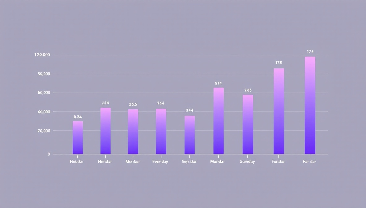
Time-of-day distribution
A 24-hour histogram of clicks is more revealing than it looks. Three patterns to watch for:
- Working-hours skew. B2B audiences cluster between 9am and 6pm local time, with a lunchtime dip. If your dashboard shows a flat 24-hour distribution for a B2B campaign, you may be looking at bot or click-fraud traffic.
- Late-night peaks. Consumer content and entertainment often peak between 9pm and midnight. If you’re targeting professionals and seeing this pattern, your audience definition is off.
- Sudden spikes. A 30-minute spike at 4:17am, followed by silence, is almost always a script. Either a scraper, an uptime monitor that accidentally followed the link, or a CI system. The clicks are real but they’re not human and you should filter them out.
What none of these metrics tell you
A click is not a conversion. Link analytics measure interest in the offer, not engagement with the destination. You can have a beautiful 1,000-click report on a campaign that converted nobody, because the landing page was broken or the offer didn’t match the audience.
Pair click analytics with destination-side analytics — GA4, your CRM, your billing system — and look for the drop-offs. Most teams that “have analytics” are actually only reading the click report, and they miss the part of the story that happens after the redirect.
The question your link analytics can answer is “did the message land and where are the people coming from.” The question your destination analytics can answer is “did the message work.” Both halves matter. Neither replaces the other.